I Asked Claude to Write My Code. It Built Me a War Room.
Fractional CMO Practice · 2026
Here is what happened when I handed Google Apps Script to an AI and stopped pretending I needed to write the whole thing myself.
Campaign Progress — 30 Demos in 60 Days
We had a goal. Thirty meetings in sixty days.
I was working as a fractional marketing leader on a pipeline push for a B2B SaaS company, and we had seven channels running simultaneously — HubSpot for CRM and sequences, Propensity for ABM display ads and marketing emails, Google Ads, LinkedIn Ads, Facebook Ads, Instantly for cold email outreach, and AiSDR for LinkedIn outreach. Every morning we were pulling numbers from seven different platforms, opening seven different tabs, and then trying to piece together whether we were actually moving toward that meeting target.
Our daily standup was fifteen minutes. We did not have fifteen minutes to spend doing data archaeology.
I knew the answer was some kind of unified view. My first instinct was to vibe code it. If you know me, you know I will reach for Lovable before I reach for a spreadsheet almost every time.
So I opened Claude Cowork and described the problem. I told it what I was trying to track, how many channels we had, and that I wanted to build something fast.
Cowork knew I like to vibe code. It said so. And then it told me, gently but clearly, that for something the whole team needed to consume and update daily, a Google Sheet would be easier. Less friction, no app to log into, already in everyone’s workflow.
I had not even considered that.
Then it told me about Google Apps Script — a scripting layer built directly into Google Sheets that could handle all the API calls and run on a nightly schedule automatically. I did not know Google Apps Script was a thing. Cowork did not just write code for me. It guided me to the right tool for the job first.
How It Actually Went
Once we aligned on the approach, I described the problem in plain language. I had seven data sources. I needed them in one place. I needed the sheet to update itself every night so I walked into standup each morning with current numbers. I wanted to see, at a glance, how each channel was contributing to the pipeline — impressions, clicks, demos booked, and meetings tracked against the 30-in-60 goal.
I was not writing a technical spec. I was talking to Cowork the way I would talk to a really competent developer I trusted.
Cowork wrote the Apps Script.
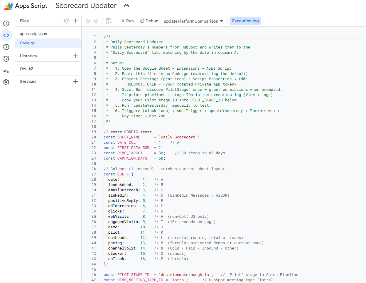
The actual Apps Script — written by Claude Cowork from a plain-language description
Not a snippet. Not a starting point. The actual code — structured triggers, API calls for each platform, error handling, and a nightly time-based trigger that ran the refresh automatically. It explained what each section did so I could follow along and make adjustments. When I had a question about the HubSpot authentication flow, it walked me through it without making me feel like I had asked something obvious.
When we started hitting data issues — numbers that did not add up, sources that looked off — I asked Cowork to help me figure out where the problems were coming from. It suggested building diagnostic tests directly into the Apps Script. Each data source would have checks to validate that it was connecting correctly, that the data coming in matched the expected structure, and that nothing had quietly broken overnight. We built those together.
Was it perfect on the first pass? No. There were a couple of spots where I had to give it more context about how our HubSpot properties were structured and how Propensity’s API response was formatted. But that back-and-forth took maybe forty minutes total. Building this from scratch? That would have been days.
What We Built
The dashboard tracked seven channels in one view:
![]()
The daily tracker tab — every channel, every metric, one row per day
HubSpot — active sequences, meetings booked, deal stage movement, and contacts enrolled in our outbound cadences.
Propensity — ABM display ads pushed to Google, Facebook, and LinkedIn, plus marketing emails sent to our target accounts. We were not using scoring or intent signals in this campaign. Propensity was the distribution engine.
Google Ads — impressions, clicks, conversions, and cost per conversion across both ABM audiences pushed from Propensity and our non-ABM campaigns running in parallel.
LinkedIn Ads — performance across both Propensity-pushed ABM audiences and our independent lead gen campaigns, including native form completions pulled directly into the sheet.
Facebook Ads — clicks, CTR, CPC, and reach across ABM and non-ABM. (Facebook ended up being our second-best channel — which genuinely surprised us.)
Instantly — emails sent, open rates, reply rates, and meetings booked from cold email outreach.
AiSDR — LinkedIn outreach activity: connection requests, likes, and personalized messages going to the same contacts receiving email through Propensity and Instantly. Because there is no native LinkedIn sync between those platforms, AiSDR bridges that gap. This is the channel where we see the strongest conversion signal, and we think we know why. The personalization is real. A contact gets a relevant email and then a LinkedIn connection request that references something specific to them. That combination converts.
Everything refreshed nightly via a time-based Apps Script trigger. Every morning, before standup, the data was current.
One tab showed the 30-in-60 goal tracker — meetings booked versus target, paced by week. You could see in ten seconds whether we were on track.
The Part That Kept Paying Off
Here is the thing about a dashboard that pulls live data from seven different platforms: stuff breaks. APIs update. Someone on the team changes how they log a deal stage in HubSpot. A platform makes a backend change without announcing it. Any of those things can quietly corrupt your numbers overnight and you will not know it until you are in standup wondering why the LinkedIn data looks wrong.
Because the tests were built in, I did not have to wonder for long.
When something does not look right, I open Cowork and ask it to find the error. That is the whole prompt. It runs through the diagnostic layer, checks where the data flow broke, and tells me what it found.
So far it has caught three things I would not have found quickly on my own:
A Propensity API update where the endpoint itself moved. The script was authenticating fine and returning no errors — it was just hitting a path that no longer existed. That is a hard thing to spot without a diagnostic layer telling you exactly where the handshake failed.
A data integrity issue in HubSpot where the team had been logging meetings inconsistently — some as “Meeting Booked,” some as “Demo Scheduled” — which meant our meeting count was undercounting. The dashboard did not cause that problem. It surfaced it. That is valuable.
And a throughput issue where email send volume through Instantly had dropped significantly. The numbers were technically valid. The data was just telling us something was wrong with the campaign cadence. Cowork flagged it as anomalous before anyone on the team had noticed.
The dashboard is not just a reporting tool. It has become an early warning system.
What Standup Looked Like After
Fifteen minutes. Actual fifteen minutes.
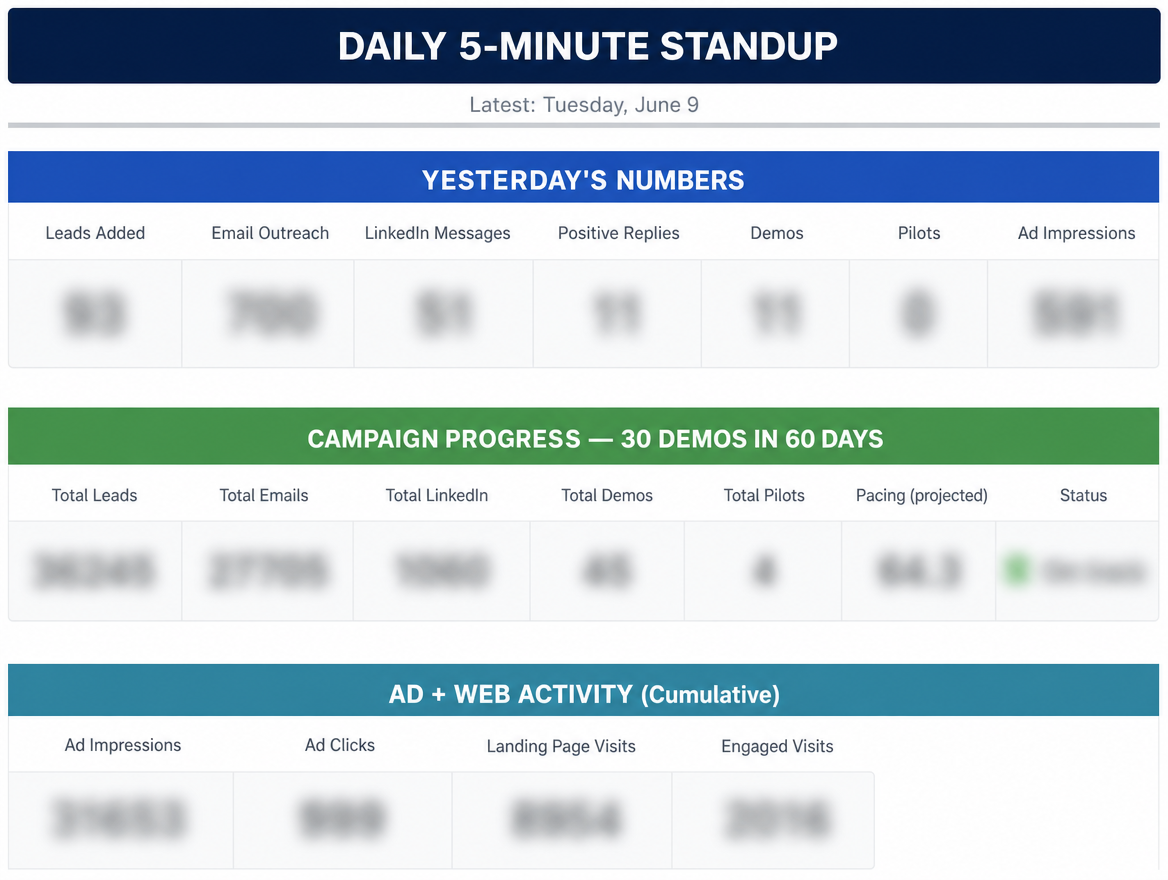
The standup view — goal tracker, yesterday’s numbers, and cumulative ad activity at a glance
We opened the sheet. We looked at the goal tracker first. Then we ran a quick channel-by-channel check — what moved overnight, what was stalling, where we needed to shift budget or attention. Google Ads was our top performer, pulling an extraordinary conversion rate on long-tail AI-focused keywords. Facebook was quietly delivering at a cost per click that made everyone happy. Instantly was struggling with personalization and we could see that in the data clearly, which meant we could make a decision about it rather than just feeling uneasy.
The dashboard did not make the decisions. We made the decisions. But it gave us a shared surface to make them from. That matters more than it sounds.
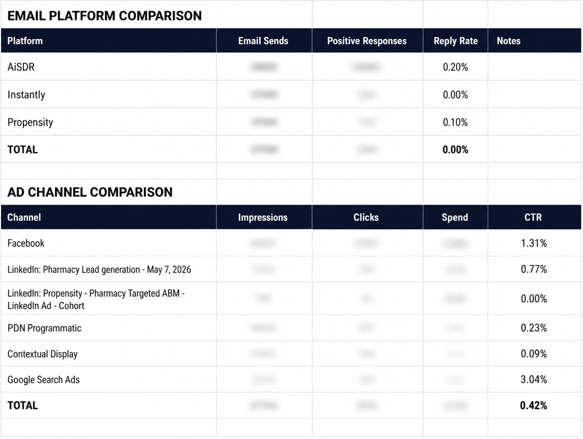
Channel comparison — email platforms and ad channels side by side, with CTR and reply rates surfacing where effort was actually paying off
The Part That Surprised Me
I showed the dashboard to Krystal on my monthly call with Propensity. She is their customer success lead and one of the sharpest people I work with on the platform side.
She asked me to walk her through how I built it.
By the end of the call, she was sharing it with her team as a potential training example. We started talking about a joint blog post. And then she told me something I did not expect: Propensity is making platform changes — partial credit to the work I did here. The way I was using their API and surfacing gaps in the workflow gave their team useful signal about what customers actually need.
The thing I built to solve an internal problem had become something other marketers wanted to learn from. And apparently something a platform was building toward.
That would not have happened if I had waited until I had the bandwidth to build it myself, or handed it off to a developer and gotten it back in three weeks. Cowork compressed the timeline from “someday” to “this afternoon.”
What This Actually Demonstrates
I talk a lot about operationalizing AI — not just using it for content or brainstorming, but weaving it into the actual systems that run your work. This dashboard is one of the clearest examples I have.
Three things made it work:
Plain language is enough. I did not need to write a technical brief or know the Apps Script documentation. I described what I needed in the same language I would use with a colleague. Cowork translated that into working code.
The AI wrote the boring parts. The trigger setup, the authentication flows, the error handling, the loop structures — none of that is interesting work. It is necessary work. Having Cowork write it meant I spent my time on the parts that actually required judgment: how to structure the goal tracker, which metrics actually mattered for standup, what the dashboard needed to make our fifteen minutes count.
A shared data surface changes how a team operates. Before the dashboard, everyone had their own version of the story. After it, we had one story. That alignment shift is real and it shows up in faster decisions and fewer “wait, what are we actually seeing from LinkedIn” moments.
Try This Yourself
You do not need a seven-channel program to make this useful. If you have even two data sources you are manually reconciling each week, Claude Cowork can help you build the Apps Script to pull them together automatically.
Start by describing the problem exactly the way you would explain it to a smart friend. Tell it what data you have, what you want to see, and how often you need it updated. Let it write the first pass. Ask questions about the parts you do not understand. Iterate.
The goal is not to become an Apps Script developer. The goal is to build the thing you need so you can spend your time on the work that actually requires you.
You already know what that thing is. What are you waiting for?
Have a multi-source dashboard you have been meaning to build? Tell me about it. I love a good “we finally have one source of truth” story.